Utilities
Transition Property
The Transition Property utility enables you to specify which properties of a UI element should be affected by transition effects. This utility is essential for creating nuanced animations that respond to user interactions, such as hover, focus, or click events.
Utility Class | USS Properties |
|---|---|
| transition-none | transition-property: none; |
| transition-all | transition-property: all; |
| transition | transition-property: background-color, border-color, color, fill, -unity-background-image-tint-color, -unity-text-outline-color, box-shadow, opacity, scale, rotate, translate, transform-origin; |
| transition-colors | transition-property: background-color, border-color, color, fill, -unity-background-image-tint-color, -unity-text-outline-color ; |
| transition-opacity | transition-property: opacity; |
| transition-shadow | transition-property: text-shadow, box-shadow; |
| transition-transform | transition-property: scale, rotate, translate, transform-origin; |
Basic Usage in UXML
To apply transition effects to specific properties, use the transition-{property} classes. These classes allow you to target individual or multiple properties for transition effects. Combine this utility with other transition utilities like Transition Duration and Transition Timing Function for comprehensive control over animations.
<ui:VisualElement class="transition-opacity transition-duration-200 hover:opacity-50">
    <!-- Element with an opacity transition over 200ms -->
</ui:VisualElement>
<ui:VisualElement class="transition-colors transition-duration-200 hover:bg-red-500">
    <!-- Element with a background color transition over 200ms -->
</ui:VisualElement>
Fine-Tuning Transition Properties
You can add new property values to suit specific design requirements.
Customize
Modifier Variations
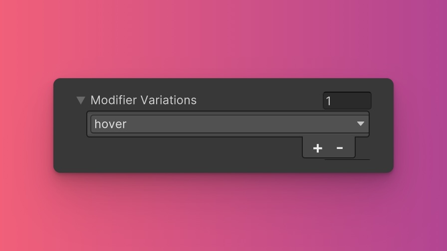
You can customize which modifier variations of the Transition Property utility are generated, such as pseudo-classes (e.g., hover, focus) and custom modifiers.
Transition Property utility.By fine-tuning the utility variations, you maintain control over your stylesheet's size and complexity, ensuring that only necessary styles are included. To update these values:
- Open the Theme Config Asset: Find the asset within your Unity project.
- Navigate to the 'Utilities' Section: Locate the
Transition Propertyutility. - Adjust Modifier Variations: Select which modifiers you want to be generated for the utility. Keep in mind that the order of the modifiers will affect the order and specificity of the generated USS classes.
Class Tags and Properties
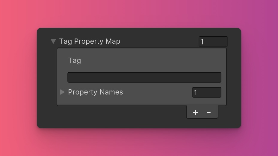
The Transition Property utility generates classes based on predefined tags and their associated USS properties. While we recommend keeping these defaults for consistency and ease of reference in our documentation, you have the option to customize them to suit your project's specific needs.
These values are prepended to the defined values in this format tag-{value}. If a tag is empty, the generated class will simply be the value by itself.
Here are the default tags and the USS properties they set for the Transition Property utility:
- transition : transition-property
To customize these tags and properties, you can edit the Tag Property Map field for the Transition Property utility in the Theme Config asset. This allows you to define new tags or modify existing ones, thus tailoring the generated classes to your preferences.
Extending Core Fields
The Transition Property utility does not extend any fields from the Core section of the Theme Config asset. Before you try to extend any fields, we recommend checking Unity's documentation to verify which types of values are expected by the relevant USS properties.
To customize or define these extended fields:
- Open the Theme Config Asset: Locate the asset within your Unity project.
- Navigate to the 'Utilities' Section: Find the
Transition Propertyutility. - Customize Extend Fields: Modify or add fields in the
Extend Fieldsarray to change the core configuration values that are extended. You'll only be able to extend fields of the same type.
Disable Utility
The Transition Property utility is enabled by default. You can disable it by unchecking the Enabled option in the Theme Config asset. This will prevent the generation of the utility's styles.