Customization
Color Customization
In ZoboUI, the color system is based on Tailwind's comprehensive color palette, which includes a scale typically ranging from 50 to 950, with 50 being the lightest and 950 being the darkest.
Understanding the Color Scale
These scales provide varying shades of each color, offering versatility in design choices.
transparent
slate
gray
zinc
neutral
stone
red
orange
amber
yellow
lime
green
emerald
teal
cyan
sky
blue
indigo
violet
purple
fuchsia
pink
rose
Adding Alpha Values
Unlike Tailwind, ZoboUI doesn't support dynamic alpha values, like text-blue-600/75. This limitation is due to Unity USS's lack of support for nested variables in functions (specifically the ability to dynamically set the opacity in an rbga function with a variable). Therefore, you'll need to add custom alpha values as distinct palettes if needed.
Adding New Colors
To add new colors to your theme:
- Go to the Theme Config Asset: Navigate to the Theme Config asset in your Unity project.
- Find the 'Colors' Field: Under the
Coresection, look for theColorsfield. - Add Your Colors: Here, you can introduce new colors or modify existing ones.
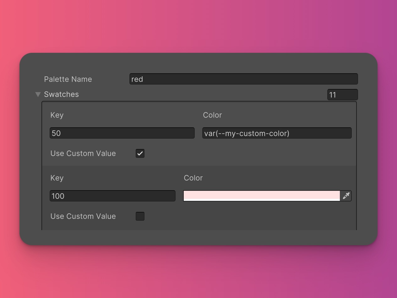
The palette name is the key e.g the red in red-50. The values are the color swatches. The swatch key is the number e.g the 50 in red-50. The value is the color in hex, rgb, or rgba format.
If you want to add new palettes, you can use tools like UIColors, Smart Swatch, or Coolors to help you come up with a color scheme.
Setting Default Keys
You can specify a default color for each palette using the DEFAULT key. For example:
"slate": {
    "value": {
      "50": "#F8FAFC",
      "100": "#F1F5F9",
      "200": "#E2E8F0",
      "DEFAULT": "#CBD5E1",
      "400": "#94A3B8",
      "500": "#64748B",
    },
}
With this configuration, using the class text-slate will default to the color #CBD5E1. However, you can still use the other shades by specifying the number, like text-slate-100.
Using Raw String Values
For advanced customization, ZoboUI allows the use of raw string values instead of the color picker. This feature is particularly useful if you want to reference USS variables in your color definitions.
To use raw string values:
- Toggle the 'Use Custom Value' in Swatch: Click the toggle to enable raw string values.
- Add Your Color Value: Add your color value as a string. For example,
var(--my-custom-color).

If the Background Color utility is enabled, this would generate the following USS:
.bg-red-50 {
	background-color: var(--my-custom-color);
}
Remember...
If you use USS variables to store your colors, you'll need to ensure that the variable is defined somewhere in your USS file or the color will not be applied.
With these options, ZoboUI makes it easy to create a color scheme that is both versatile and tailored to your project's aesthetic. The ability to define default colors and add new palettes ensures your UI is vibrant and cohesive.