Utilities
Scale
The Scale utility provides a powerful way to adjust the visual size of elements without altering their box model properties, such as padding, border, and margins. It can be used to create dynamic UI effects, such as hover animations, focus indicators, or simply to draw attention to particular elements.
Utility Class | USS Properties |
|---|---|
| scale-0 | --zb-scale-x: 0; --zb-scale-y: 0; |
| scale-50 | --zb-scale-x: 0.5; --zb-scale-y: 0.5; |
| scale-75 | --zb-scale-x: 0.75; --zb-scale-y: 0.75; |
| scale-90 | --zb-scale-x: 0.9; --zb-scale-y: 0.9; |
| scale-95 | --zb-scale-x: 0.95; --zb-scale-y: 0.95; |
| scale-100 | --zb-scale-x: 1; --zb-scale-y: 1; |
| scale-105 | --zb-scale-x: 1.05; --zb-scale-y: 1.05; |
| scale-110 | --zb-scale-x: 1.1; --zb-scale-y: 1.1; |
| scale-125 | --zb-scale-x: 1.25; --zb-scale-y: 1.25; |
| scale-150 | --zb-scale-x: 1.5; --zb-scale-y: 1.5; |
| scale-none | --zb-scale-x: none; --zb-scale-y: none; |
| scale-x-0 | --zb-scale-x: 0; |
| scale-x-50 | --zb-scale-x: 0.5; |
| scale-x-75 | --zb-scale-x: 0.75; |
| scale-x-90 | --zb-scale-x: 0.9; |
| scale-x-95 | --zb-scale-x: 0.95; |
| scale-x-100 | --zb-scale-x: 1; |
| scale-x-105 | --zb-scale-x: 1.05; |
| scale-x-110 | --zb-scale-x: 1.1; |
| scale-x-125 | --zb-scale-x: 1.25; |
| scale-x-150 | --zb-scale-x: 1.5; |
| scale-x-none | --zb-scale-x: none; |
| scale-y-0 | --zb-scale-y: 0; |
| scale-y-50 | --zb-scale-y: 0.5; |
| scale-y-75 | --zb-scale-y: 0.75; |
| scale-y-90 | --zb-scale-y: 0.9; |
| scale-y-95 | --zb-scale-y: 0.95; |
| scale-y-100 | --zb-scale-y: 1; |
| scale-y-105 | --zb-scale-y: 1.05; |
| scale-y-110 | --zb-scale-y: 1.1; |
| scale-y-125 | --zb-scale-y: 1.25; |
| scale-y-150 | --zb-scale-y: 1.5; |
| scale-y-none | --zb-scale-y: none; |
Understanding Scale
Scaling transformations are applied via USS, allowing for fine-grained control over the horizontal and vertical scaling factors. A scale factor of 1 means the element is at its natural size, values less than 1 shrink the element, and values greater than 1 enlarge it.
Note
The element must also have the transform utility applied for the scale effect to take place.
Applying Uniform Scale
To scale an element uniformly in both the x and y axes, use the scale- classes. For example, scale-100 applies a neutral scale, keeping the element at its original size, while scale-50 reduces its size to half.
<ui:VisualElement class="transform scale-50">
  <!-- Element scaled to 50% of its original size in both x and y axes -->
</ui:VisualElement>
Applying Axis-Specific Scale
You can also apply scaling transformations to individual axes using scale-x- and scale-y- classes, allowing for non-uniform scaling effects.
<ui:VisualElement class="transform scale-x-110 scale-y-90">
  <!-- Element widened to 110% along the x-axis and slightly contracted to 90% along the y-axis -->
</ui:VisualElement>
Customize
Modifier Variations
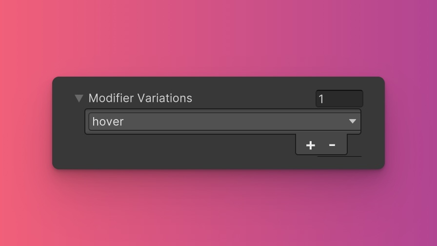
You can customize which modifier variations of the Scale utility are generated, such as pseudo-classes (e.g., hover, focus) and custom modifiers.
Scale utility by default:- hover
- focus
By fine-tuning the utility variations, you maintain control over your stylesheet's size and complexity, ensuring that only necessary styles are included. To update these values:
- Open the Theme Config Asset: Find the asset within your Unity project.
- Navigate to the 'Utilities' Section: Locate the
Scaleutility. - Adjust Modifier Variations: Select which modifiers you want to be generated for the utility. Keep in mind that the order of the modifiers will affect the order and specificity of the generated USS classes.
Class Tags and Properties
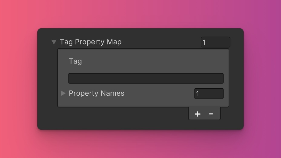
The Scale utility generates classes based on predefined tags and their associated USS properties. While we recommend keeping these defaults for consistency and ease of reference in our documentation, you have the option to customize them to suit your project's specific needs.
These values are prepended to the defined values in this format tag-{value}. If a tag is empty, the generated class will simply be the value by itself.
Here are the default tags and the USS properties they set for the Scale utility:
- scale : --zb-scale-x, --zb-scale-y
- scale-x : --zb-scale-x
- scale-y : --zb-scale-y
To customize these tags and properties, you can edit the Tag Property Map field for the Scale utility in the Theme Config asset. This allows you to define new tags or modify existing ones, thus tailoring the generated classes to your preferences.
Extending Core Fields
The Scale utility does not extend any fields from the Core section of the Theme Config asset. Before you try to extend any fields, we recommend checking Unity's documentation to verify which types of values are expected by the relevant USS properties.
To customize or define these extended fields:
- Open the Theme Config Asset: Locate the asset within your Unity project.
- Navigate to the 'Utilities' Section: Find the
Scaleutility. - Customize Extend Fields: Modify or add fields in the
Extend Fieldsarray to change the core configuration values that are extended. You'll only be able to extend fields of the same type.
Disable Utility
The Scale utility is enabled by default. You can disable it by unchecking the Enabled option in the Theme Config asset. This will prevent the generation of the utility's styles.