Advanced Guides
Styling Inaccessible Nested Elements
In Unity's UI Toolkit and UI Builder, elements like TextField often contain nested elements such as labels and input fields. These nested elements are usually greyed out in the hierarchy, indicating that they are dynamically generated and not directly accessible for styling with classes. This can be frustrating when trying to apply custom styles to these elements in the UI Builder.
Let's take this example of a TextField in the UI Builder: 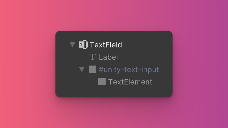
It contains a Label and a VisualElement named #unity-text-input but they're greyed out in the hierarchy, which means we won't be able to add classes to them directly in the UI Builder. What if we wanted to change the background color of the input element? 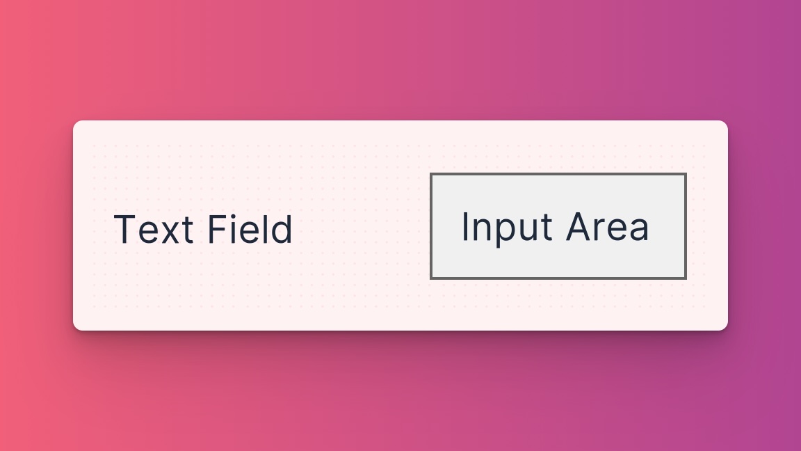 One solution is to leverage USS child and descendant selectors and create a custom class in a separate USS file like :
TextField #unity-text-input {
  background-color: red;
}
This would work, but now we're maintaining multiple USS files, and even worse, it's not immediately clear to other developers where this style is coming from without digging into the USS file. Over time, this can be cumbersome and difficult to maintain, and it also goes against the idea of making it easy to understand how elements are styled just by looking at their classes in UXML.
So how can we make this work in a way that is more intuitive and easier to maintain? We can use ZoboUI's custom modifiers.
Using Modifiers for Inaccessible Elements
Modifiers are usually used to generate classes that change the style of an element depending on its state (e.g. pseudo-classes like hover and focus). However, they can also be used to format the selector that is generated for a class. We'll use this to style specific nested elements.
Step 1: Define the Custom Modifier
To begin, access the ZoboUI configuration asset in your Unity project. Once there, navigate to the Core section and find the Modifiers option. This is where you can add a new modifier to address our specific use case.
For instance, to target the #unity-text-input within a TextField, you might want to create a new modifier called textfieldinput. For the value, you can use the following selector:
{{generated_class}} > #unity-text-input
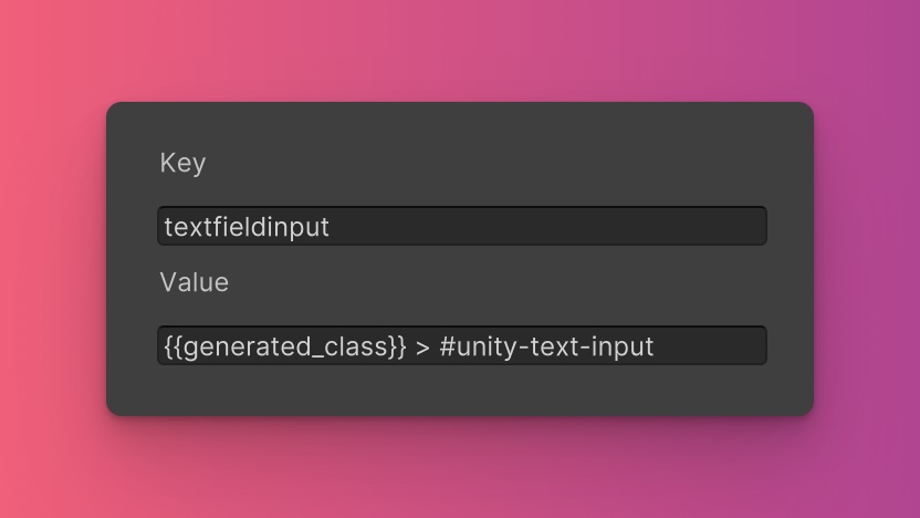
This targets the #unity-text-input element that is a direct child of the element with the generated class. If you want to target any descendant element with the #unity-text-input id, you can use the following selector:
{{generated_class}} #unity-text-input
When the USS is generated, the {{generated_class}} variable is replaced with the generated class of the element that the modifier is applied to, using the name you provided. For example, the generated class might look like this if enabled for the Background Color utility.
.textfieldinput_bg-red-500 > #unity-text-input {
  background-color: red;
}
If you wanted to make the modifier more generic, for example, to target any input fields within an element, you could find a common class that is applied to all input fields and use that in the selector. For example, if you click on the #unity-text-input element in the UI Builder, you will see that it has other input-related classes applied to it.
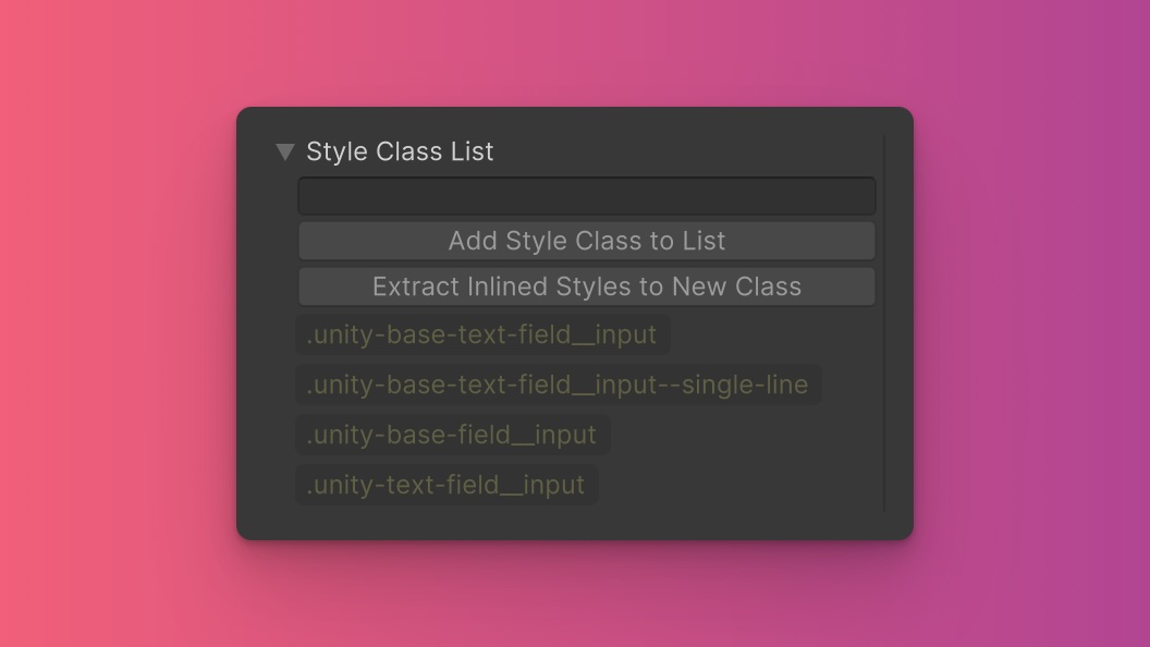
You can also target pseudo-classes like hover and focus by adding them to the selector. For example, if you wanted to target the #unity-text-input element only when it is hovered, we could name this modifier hoveredTextFieldInput. For the selector format, we could use the following:
{{generated_class}} > #unity-text-input:hover
This would generate the following class:
.hoveredTextFieldInput_bg-red-500 > #unity-text-input:hover {
  background-color: red;
}
Important Note
When creating pseudo-class modifiers, you'll need to make sure that the nested element actually receives the relevant pointer events as some elements are deliberately excluded from receiving them for performance reasons. We recommend using the UI Toolkit Debugger for this.
Step 2: Enable the Modifier for Utilities
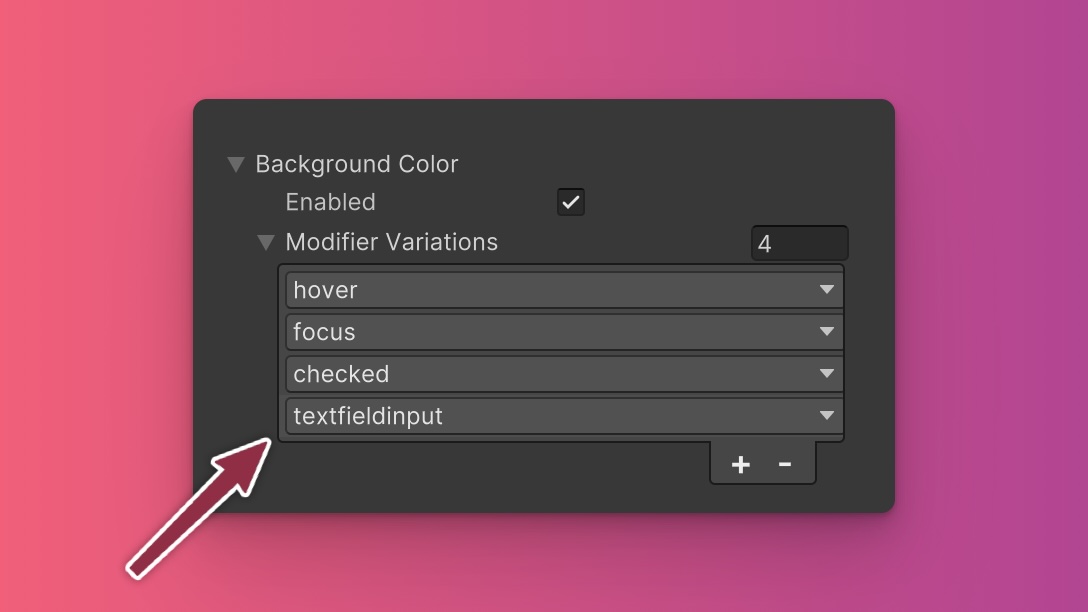 Once you've created the modifier, you'll need to enable it for the utilities you want to use it with. In this case, we want to use it with the
 Background Color utility, so we'll enable it there under the Utilities section of the Theme Config asset.
Step 3: Regenerate the USS
Once you've enabled the modifier for the utilities you want to use it with, you'll need to regenerate the USS. You can do this by clicking the Generate button in the Settings section of Theme Config asset (it should be at the top).
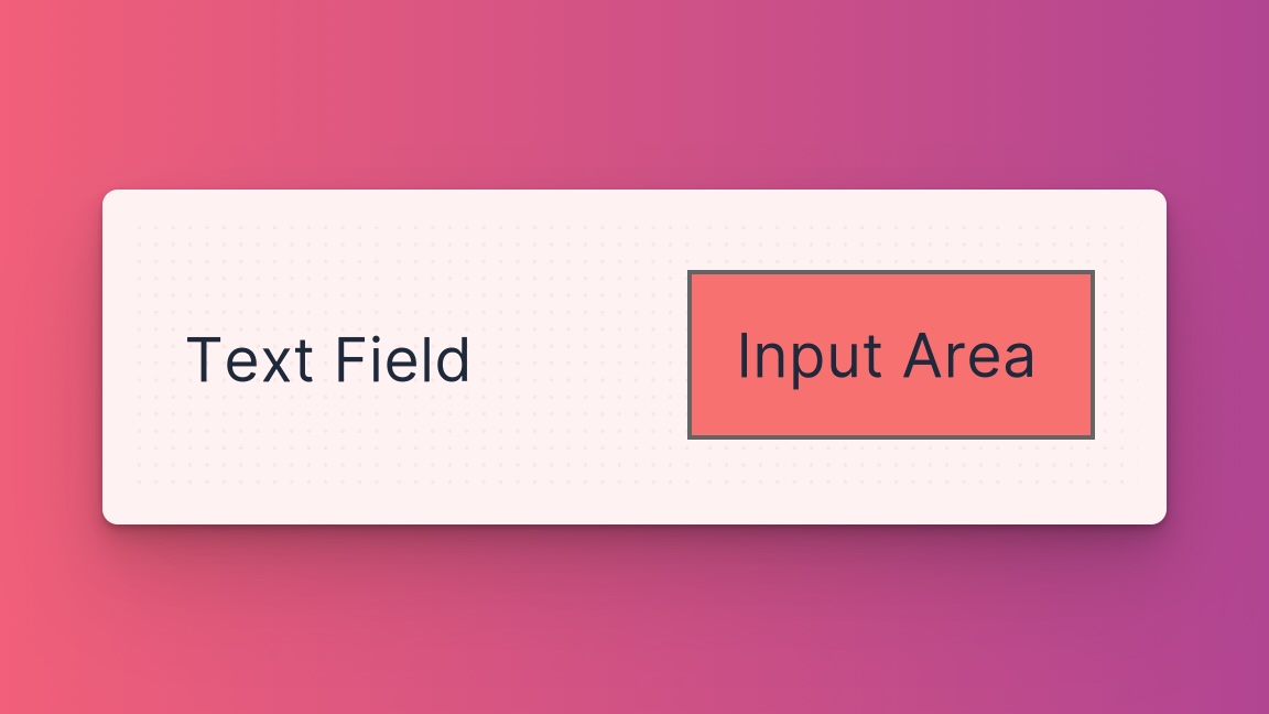
Now you can use the modifier in UXML and it will be applied to the generated class of the element. For example, if you apply the textfieldinput_bg-red-500 class to a TextField, it will target the #unity-text-input element with a red background.
<ui:TextField class="textfieldinput_bg-red-500" />
A Better Way?
Although custom modifiers are a solution to this specific use case, we suggest using that approach sparingly. It's best to reserve it for elements you don't have control over.
For custom elements, we recommend avoiding dynamically generated elements and instead creating them as separate elements in UXML. This will make it easier to style them with classes and keep your code more maintainable.
For example, instead of using a TextField with a nested Label and VisualElement, you could create a custom MyCustomTextFieldLabel element and a MyCustomextFieldInput element.
<MyCustomTextField>
  <MyCustomTextFieldLabel class="hover_text-sky-500" />
  <!--  apply classes to the input element directly -->
  <MyCustomextFieldInput class="bg-red-500" />
</MyCustomTextField>
Now you can style the individual elements with classes and avoid the need for custom modifiers.